
Stay on top of what happens at evo2b.
Subscribe to our newsletter:
You will receive first hand our new projects, publications in the media and possible partnerships.
You will receive first hand our new projects, publications in the media and possible partnerships.


The logo carries the weight of being the visual representation of a brand. It is the essence of a company manifested in a figure.
When designing a logo, we materialize ideas in a delicate and subtle way, we translate complex concepts into clear, accessible and uncomplicated forms.
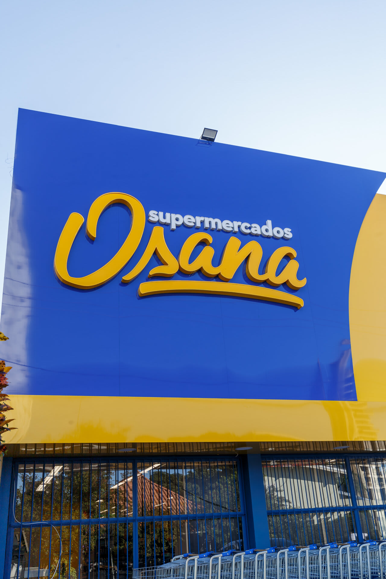
Coming from a traditional network of markets , Supermercado Osana was baptized with the same name as its founder, bringing a well-known and familiar name to a new brand.
Family, warmth and proximity were the key words that guided the entire brand creation project - and then the supermarket itself.
We brought the family's identity using calligraphic typography, emulating the signature of the founder herself.
For the decoder, we used supermarket in bold, bringing a nice font to read and allowing its use as a base typography for the entire brand.
For complementary use, the logo was transformed into a stamp, which can be applied to different materials, such as stationery, plastic bags and different labels.